What it is
For our project, Brazil's CO2 emssion through the export via nautical shipping is visualized. We want the user to be able to explore where the ships are going and which countries that import what from Brazil, and what impact this has on carbon dioxide emissions.
How to navigate
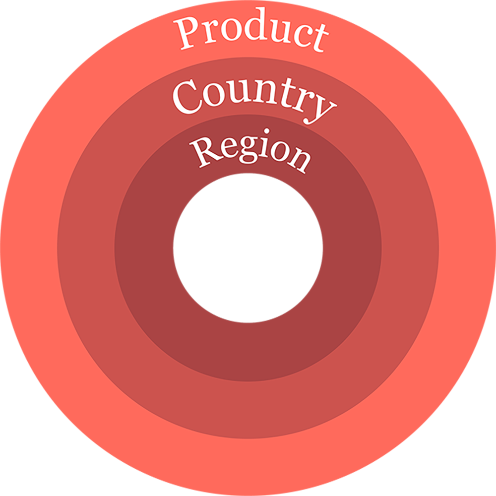
The website features an interactive sunburst with an interactive world map inside of it. The sunburst is divided into three different layers, each with it's own level of specificity. Hovering over each layer gives infomation about that part of the layer's CO2 emission. The sunburst's innermost layer is categorized as Regions, as given in the data produced by SEI. The middle layer is Countries and the outermost layer is the Category of product exported. Clicking any of the nodes of the sunburst collapses every other node on that layer to give a better view of that single node. Clicking the node again zooms out the sunburst.
The world map is zoomable and draggable for easy access to smaller countries. It is also colorcoded according to the different Regions. Clicking a country on the world map does the same thing as clicking a node on the sunburst. The user also has the opportunity to search for a country directly in the search bar.
